Verifly is a drone insurance app, where in just a few taps you can get insurance. I worked with the CEO, programmers and other designers to create the best UI/UX for users.
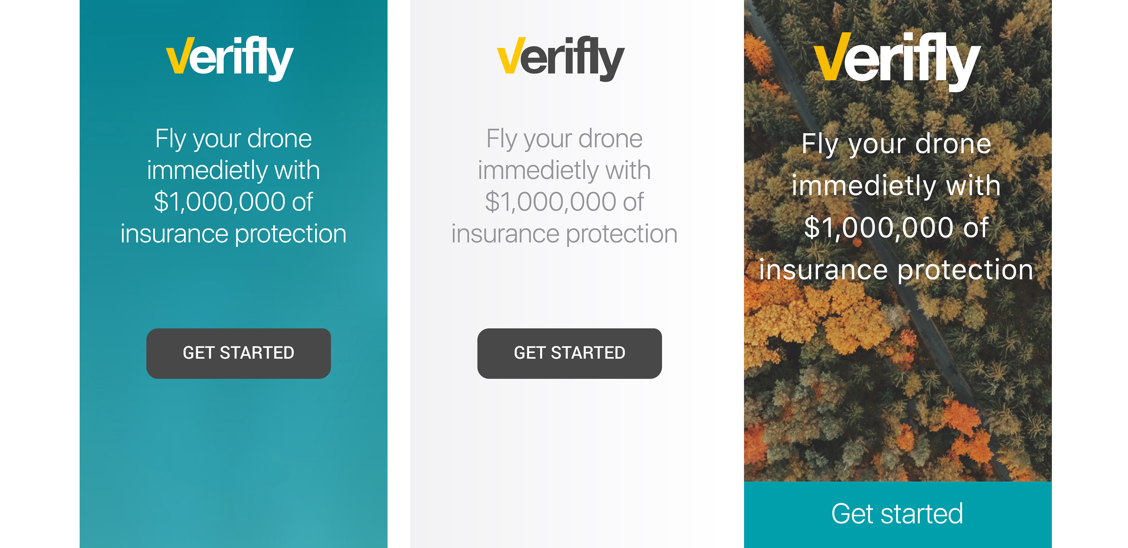
I try a variety of colors, shapes, slogans to see what works and what doesn't.
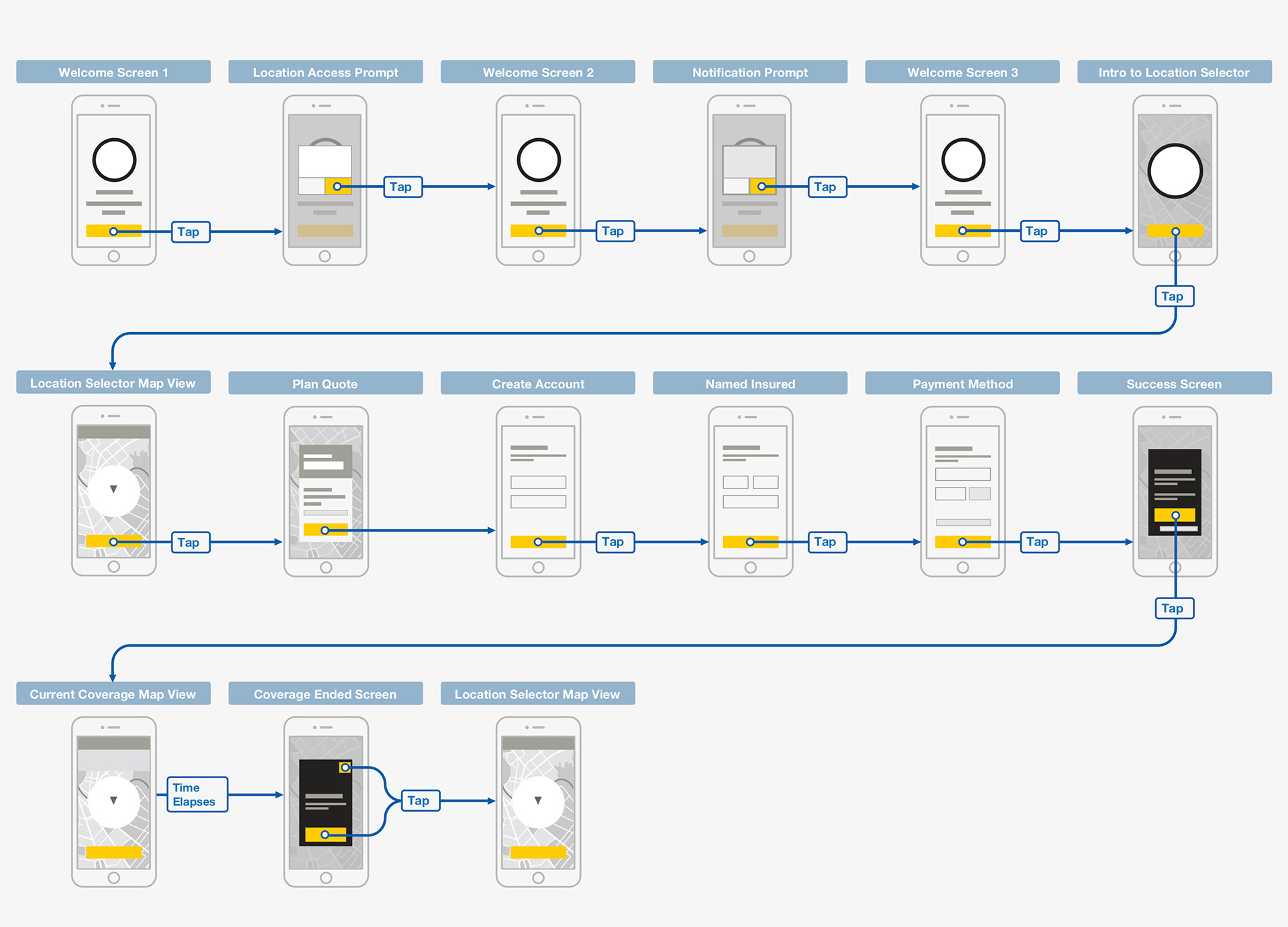
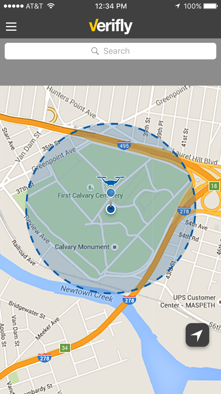
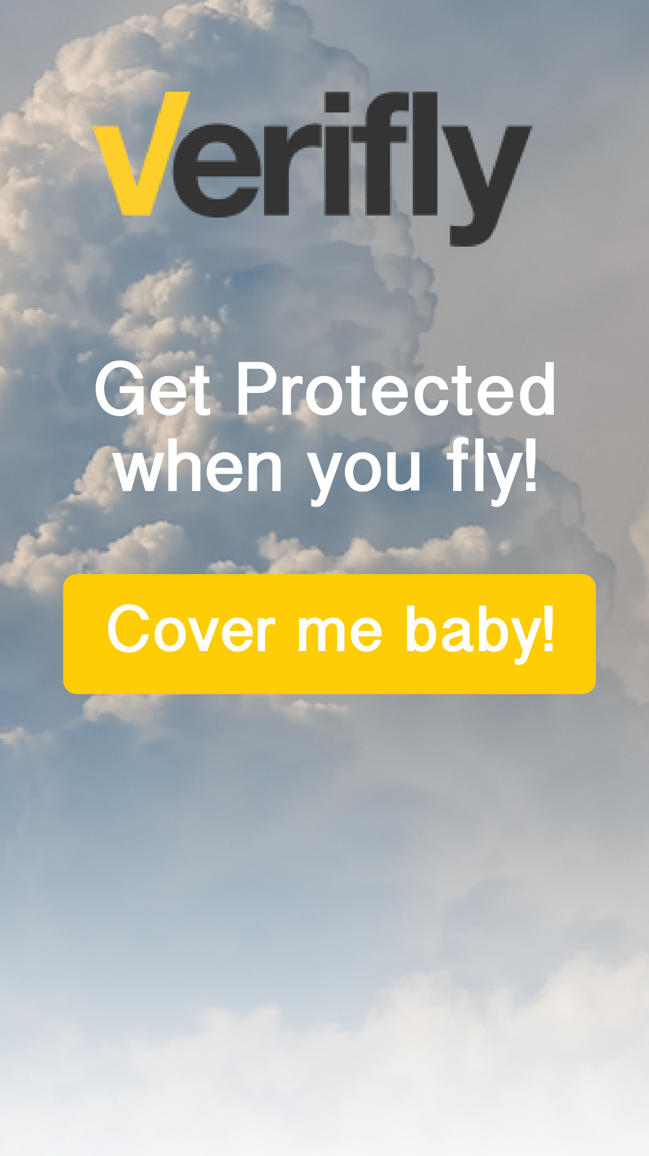
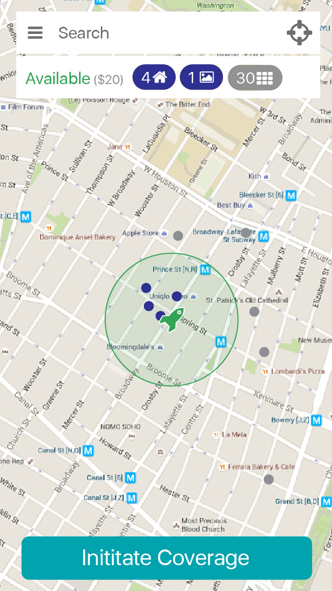
My first design is very basic and tries to get the point across quickly. I am not doing these initial designs to do a "successful" design. In fact, I'm doing them to see how the CEO reacts in regards to prioritization and setup. Does he want a large number for notifications or smaller? Does he like the idea of having a large search bar at the top? Does he like the idea of a dropdown? All small and very important steps.
I design the onboarding process while designing map section itself. Why? So that I can save weeks of time. For example, while doing the onboarding, the CEO tells me that he wants the call to action to be yellow. Because of this, the map design has to change because color is very important for this App, so that affects the color of the other icons and therefore the entire design.
If I had not done the onboarding at the same time, there is a good chance that color of the icons and CTA (call to action) would be different, and therefore the UX would slightly be different as well. To be told the CTA needs to be yellow after the entire process would trigger a change in Ui & Ux design, wasting weeks of time.
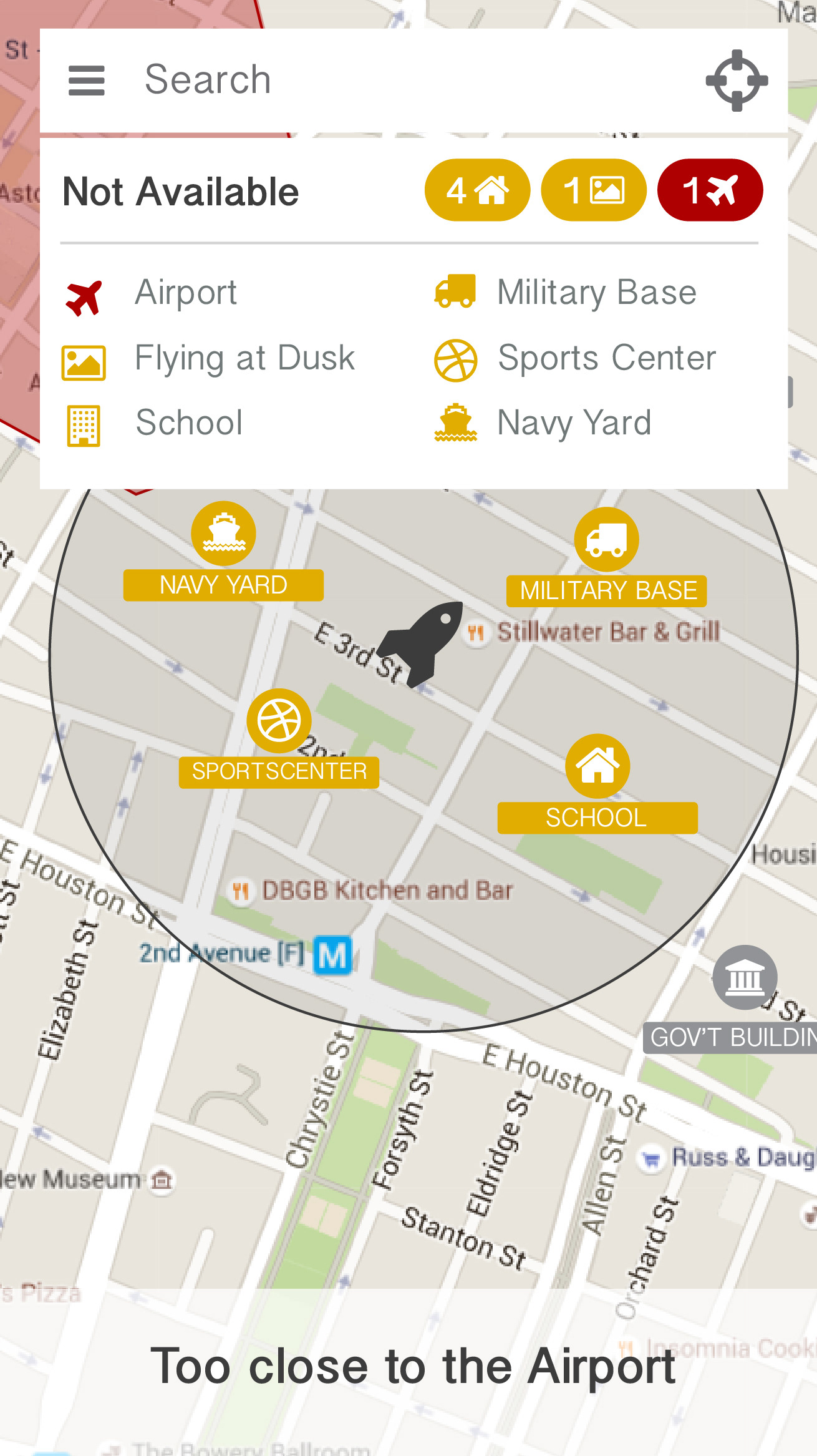
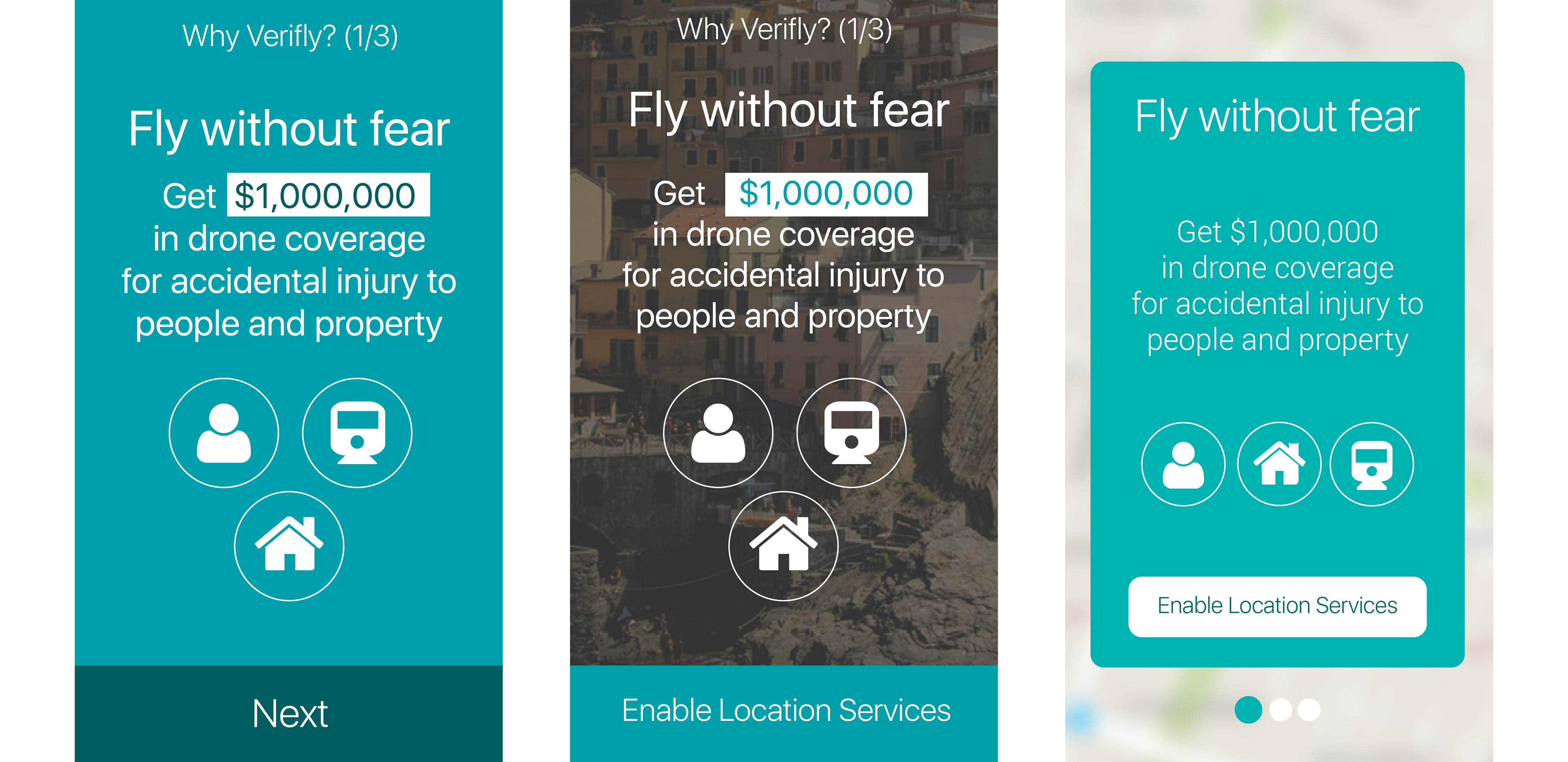
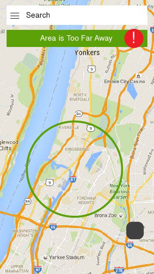
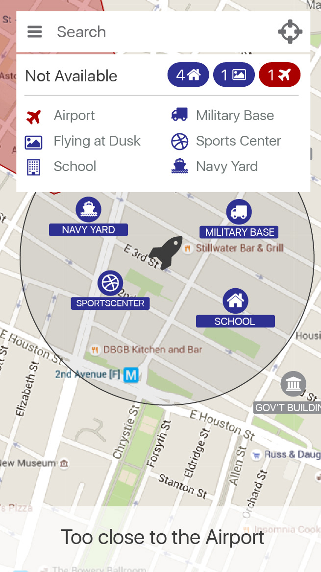
I notice that the glaring red color is too distracting for alerts. We want the users who are flying drones to know whats happening, but not to be constantly freaked out by alerts and extreme colors. I decide to use softer colors and text. For the "Too Close to the Airport" copy I use a gentle white background.
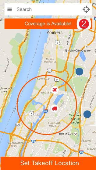
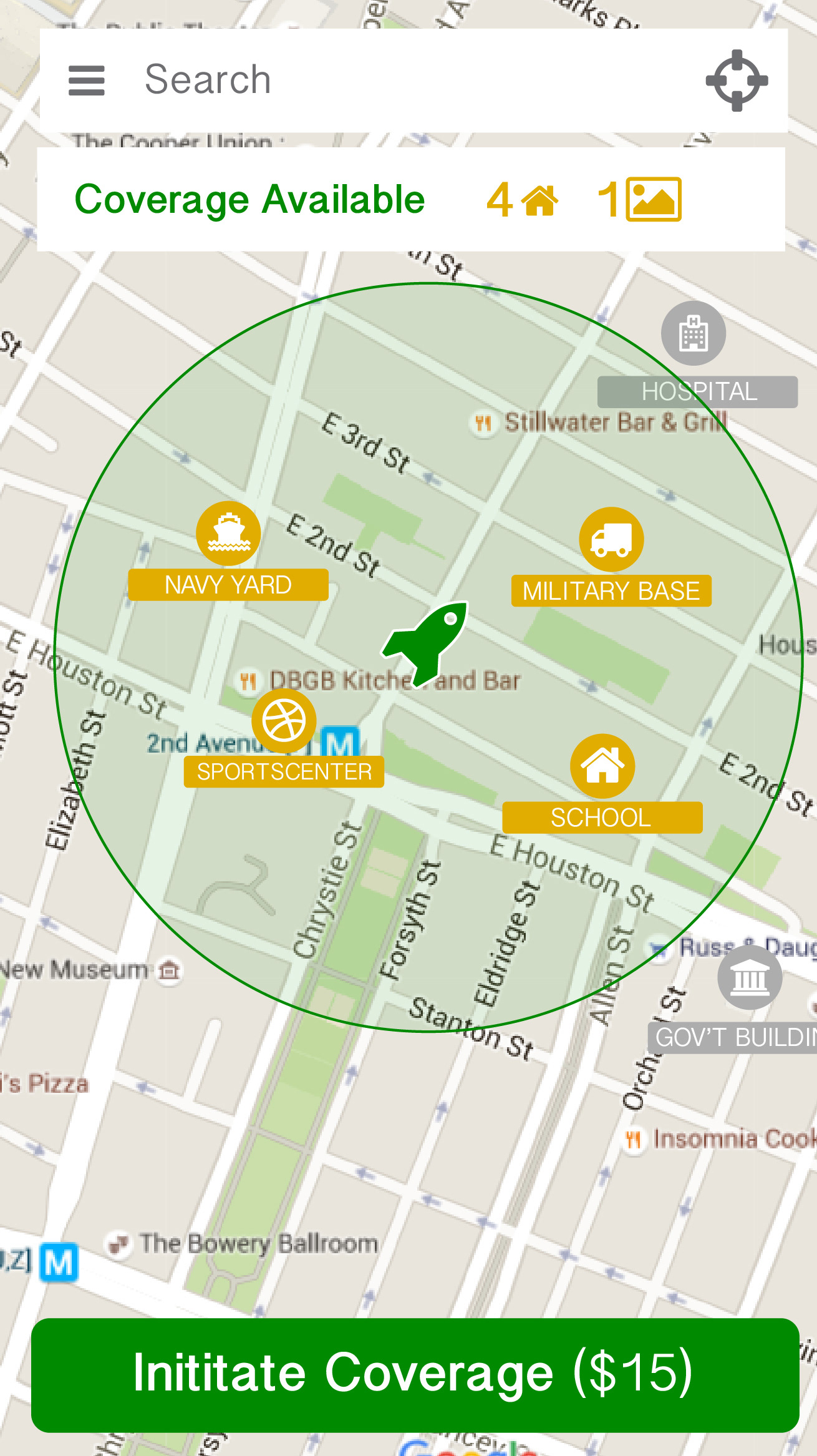
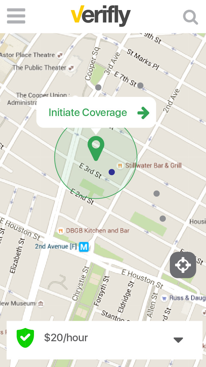
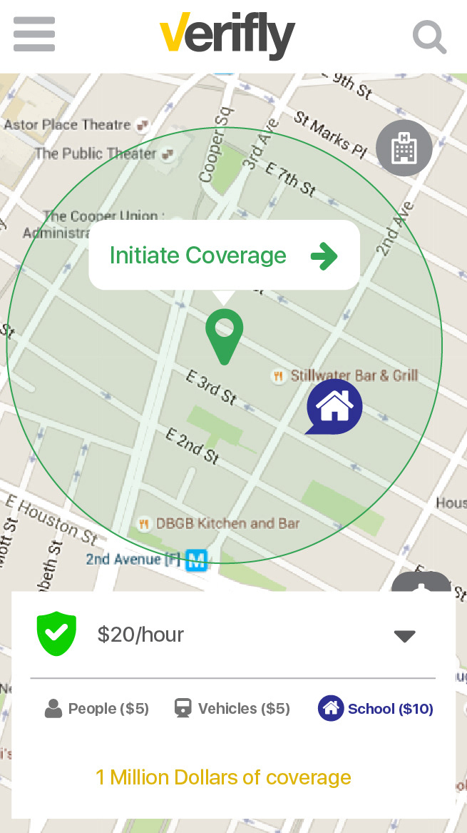
The team and I come to an epiphany! We realize that we should put the CTA in the center. This saves the user time and energy.
We also removed the expanded search section and simply put an icon in the top right. This is a course corrected prioritization. I also experiment with different center CTA sizes and copy, such as "Initiate Coverage" and "$20/hour".
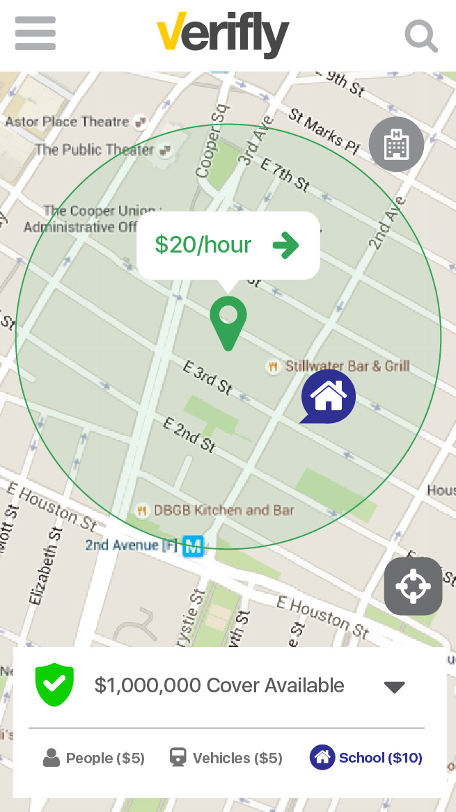
For the price, we decided to place it at the bottom with the same text height as other icons. We didn't want the users to think about price while using the app. We wanted price to be at 2nd and/or third level importance. Finding successful coverage was the main focus.
With After Effects, I created an animation of what I had designed so far. From time to time, I do this for complex apps to get a real feel for how they would work. Instantly, I can see positives and negatives of what I had designed
Now, we have decided to put $1,000,000 coverage up at the top. What's important is to create designs that can handle new important elements at any given time. So, even though this is a new element that has #1 priority, the existing design can be maintained.
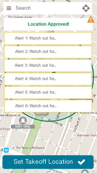
We make "SET TAKEOFF LOCATION" the main copy for the CTA. At the bottom, I experiment with different price sizes and UX's for the detailed information.
Icons are now larger and more accurate. I find that visuals and icons are a good way to communicate things to the user in a quick way. Our users are flying drones so quickness is important.

Final Design
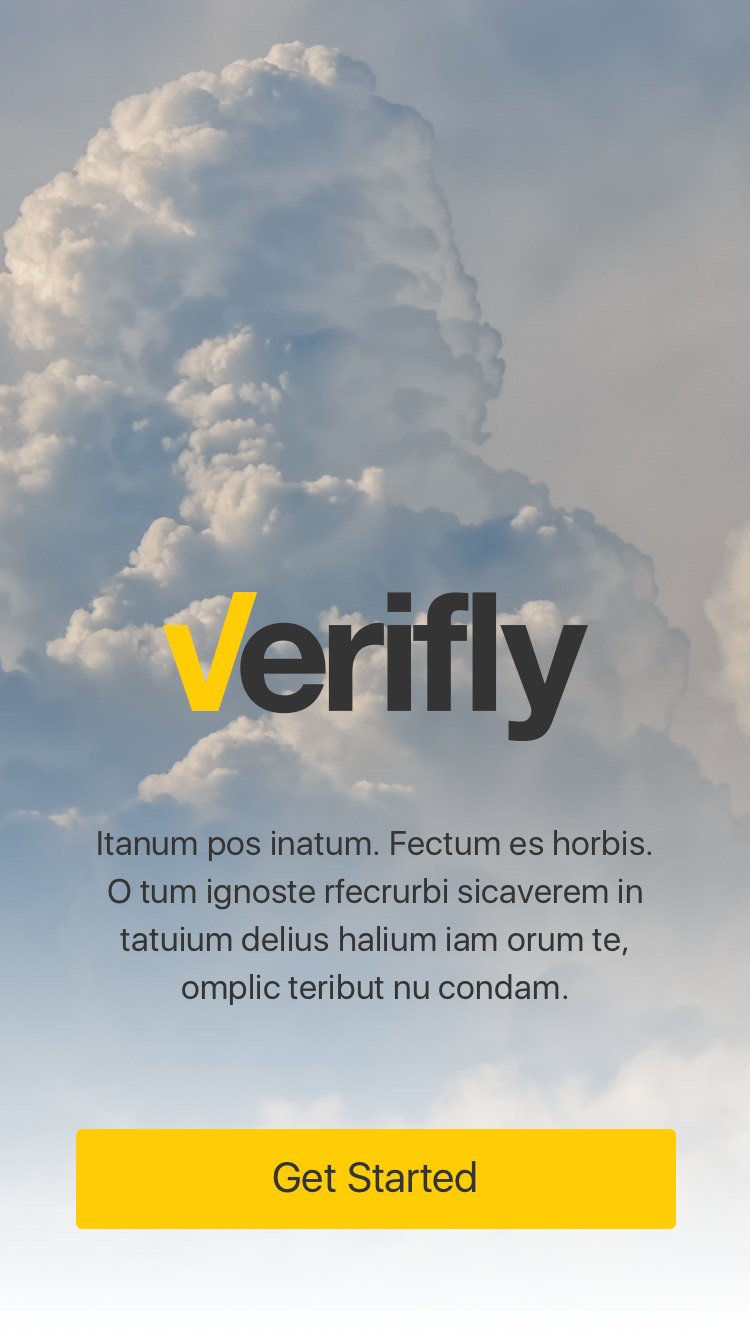
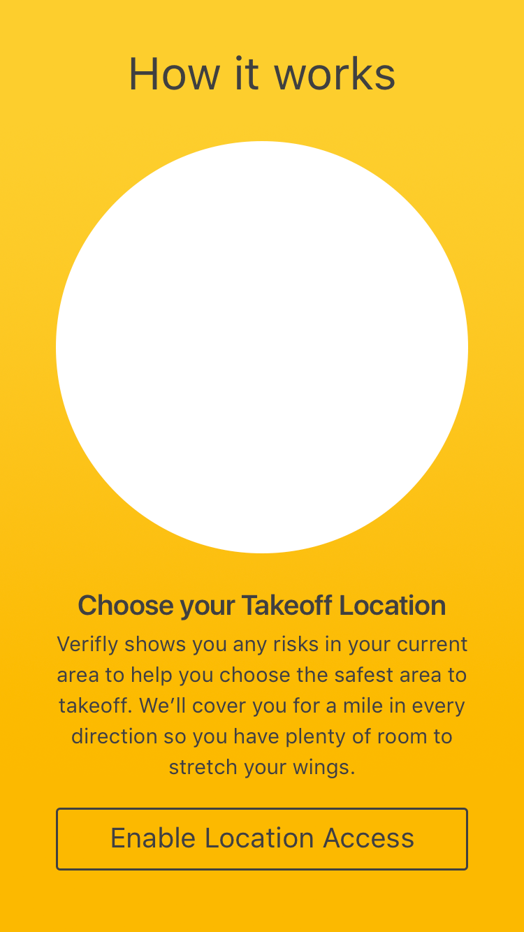
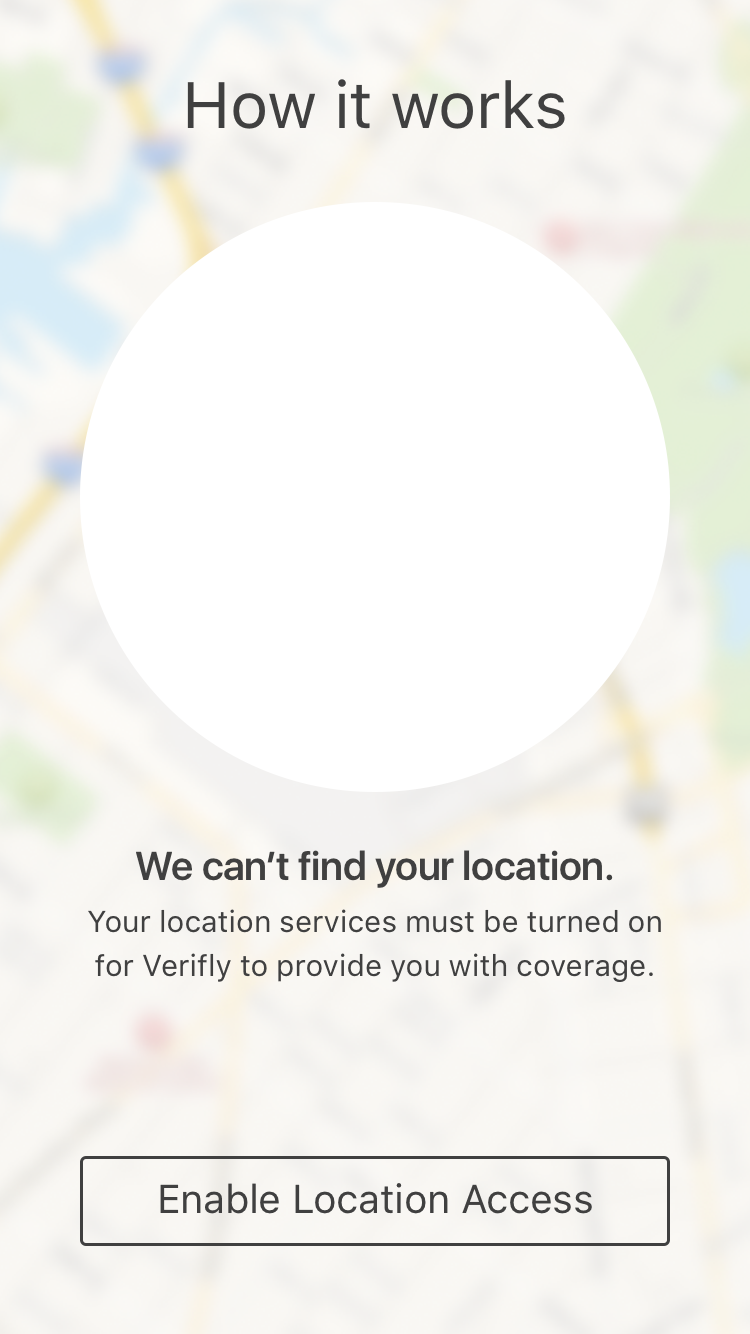
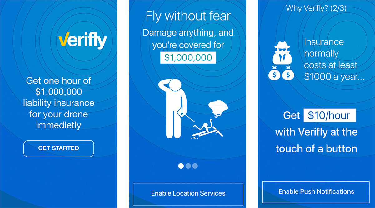
With the Onboarding, I designed a new blue circle ripple. This exudes a sense of fun, location and area. All things we want to communicate about drone insurance. CTA is now a white outline.
This is different from the main map UI and that's ok. Sometimes it's good to have stark differentiation between the two. They will only see this onboarding process once, so consistency in UI is not the most important thing. The most important thing here is to get them to use the app.
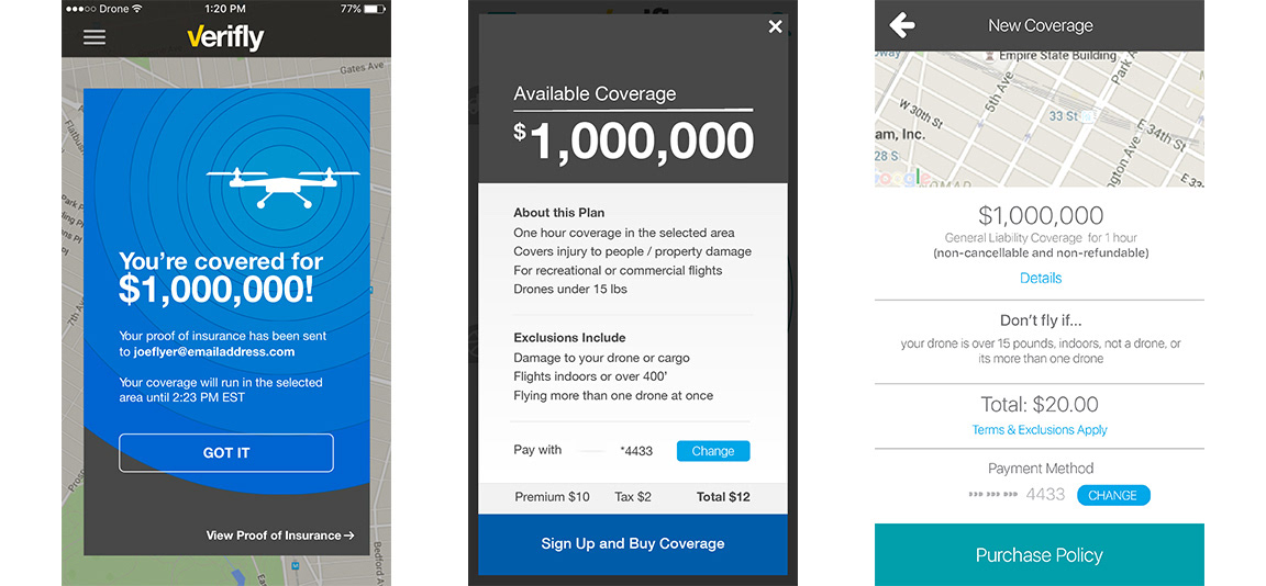
Now that onboarding has been approved, I start designing the more esoteric pages such as the $1,000,000 coverage popups and pages.
The final design is complete
Final Design
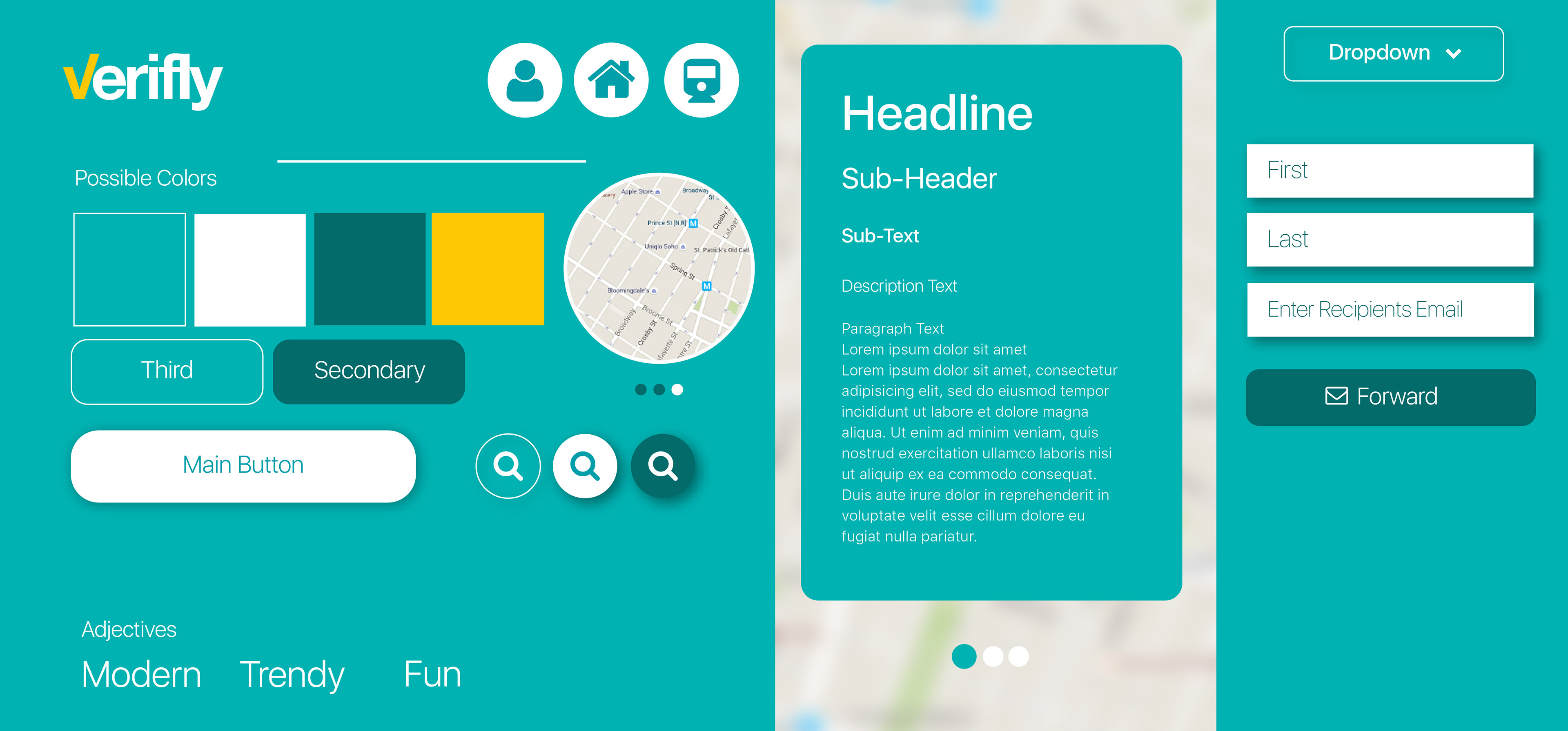
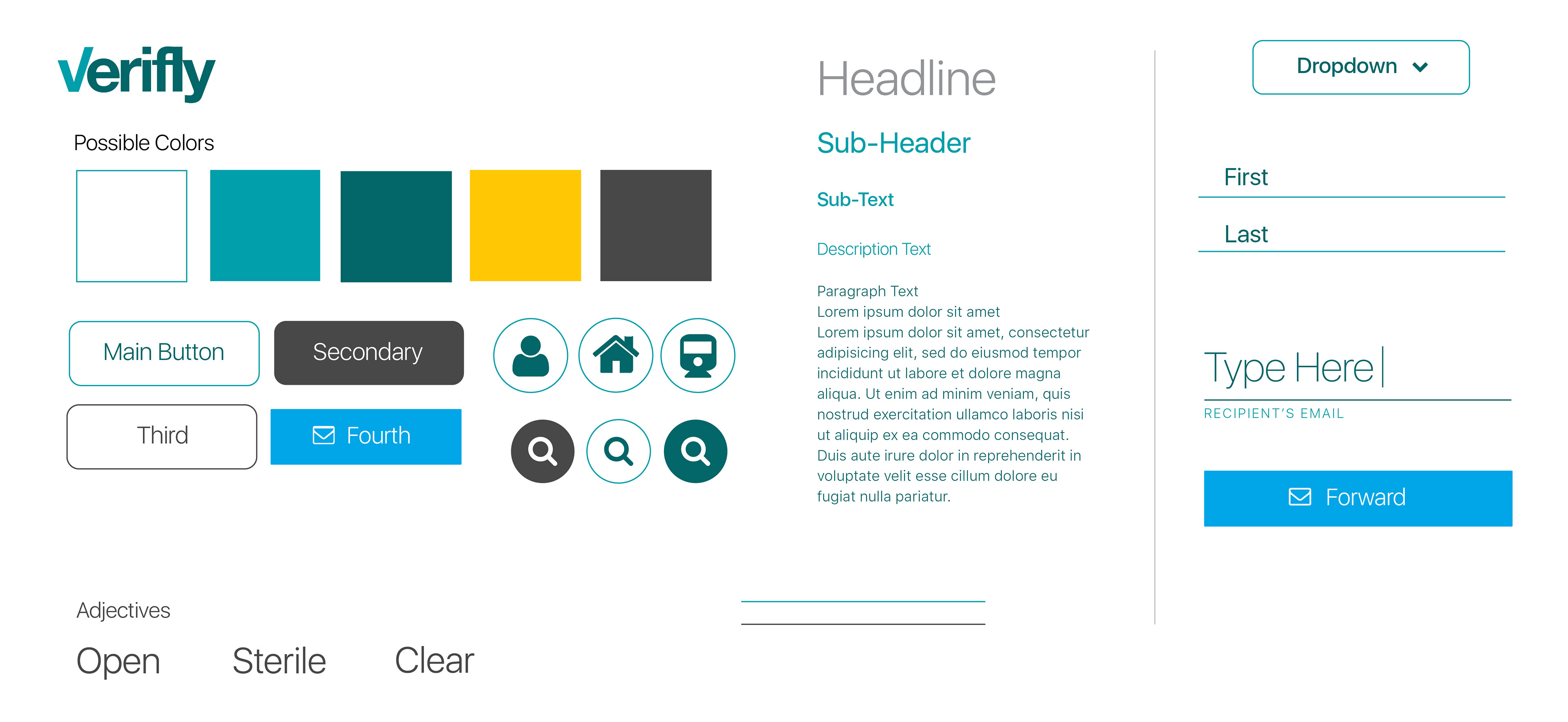
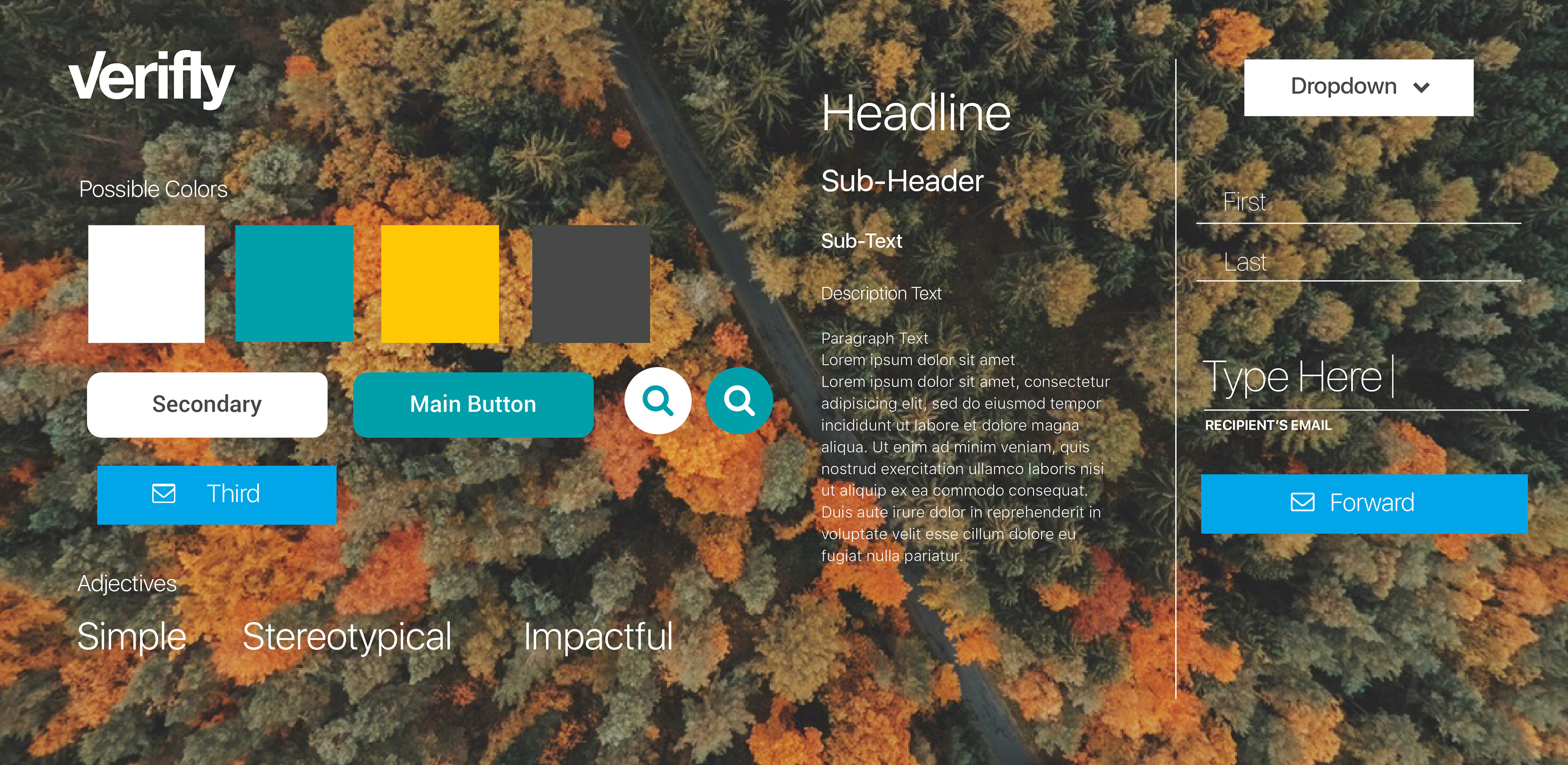
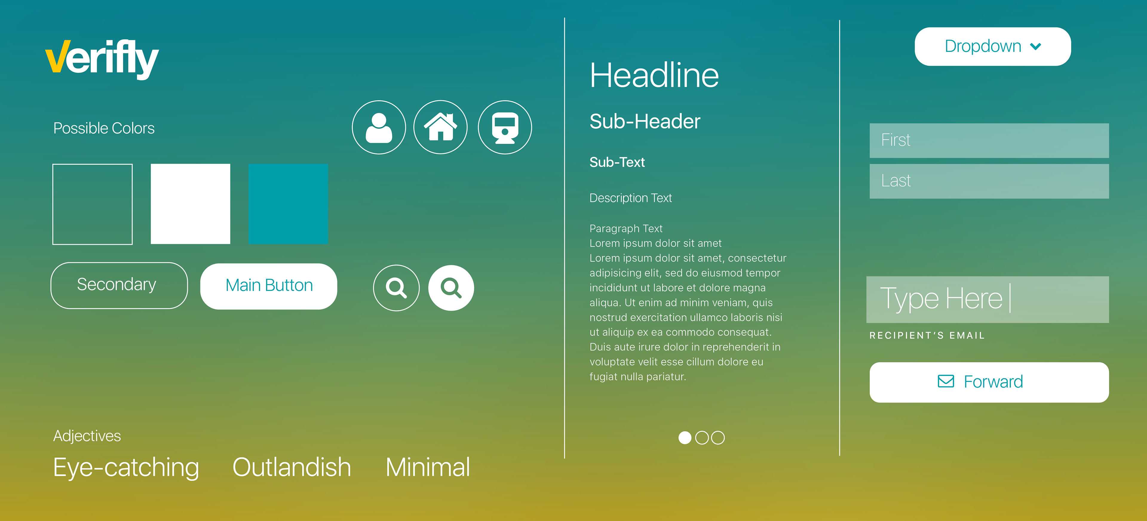
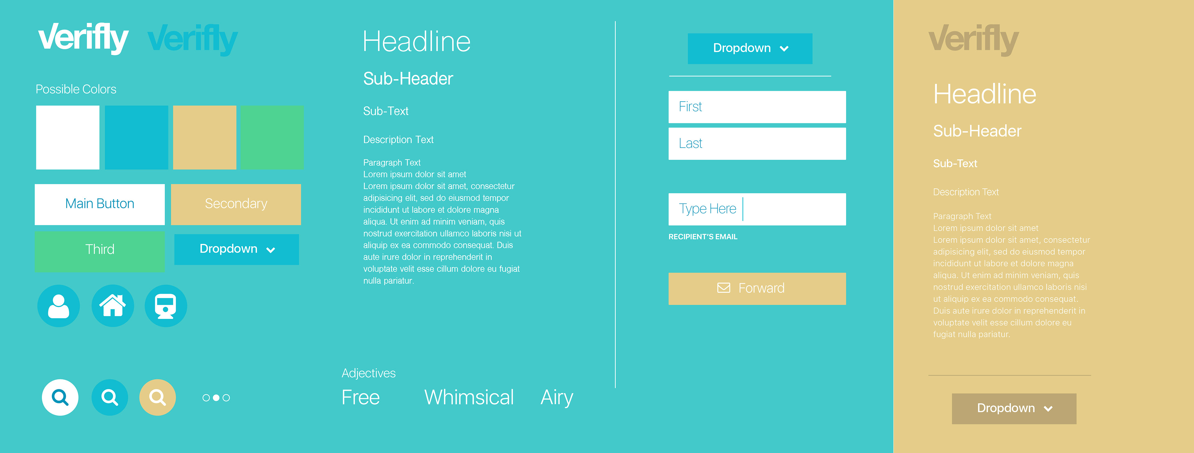
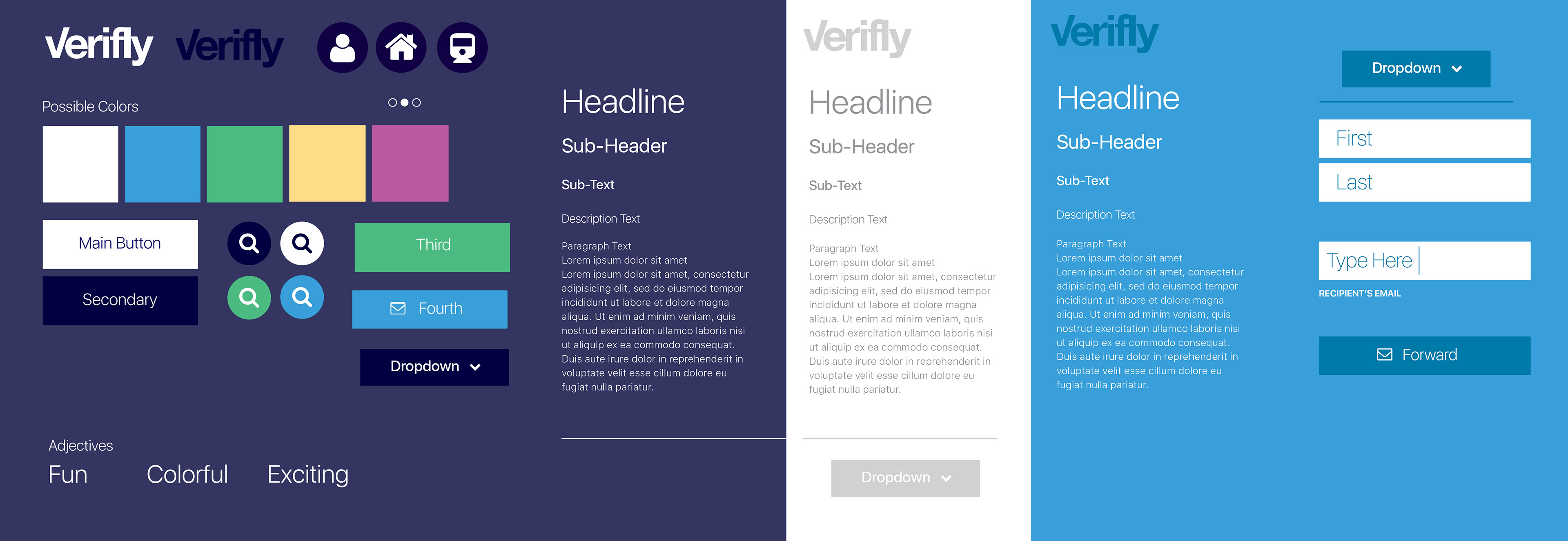
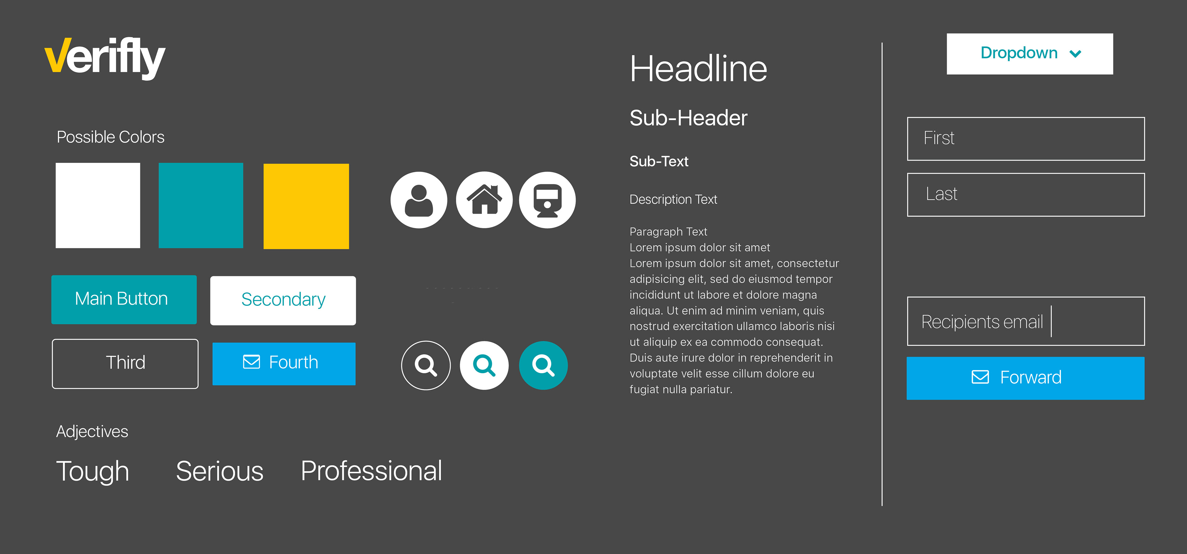
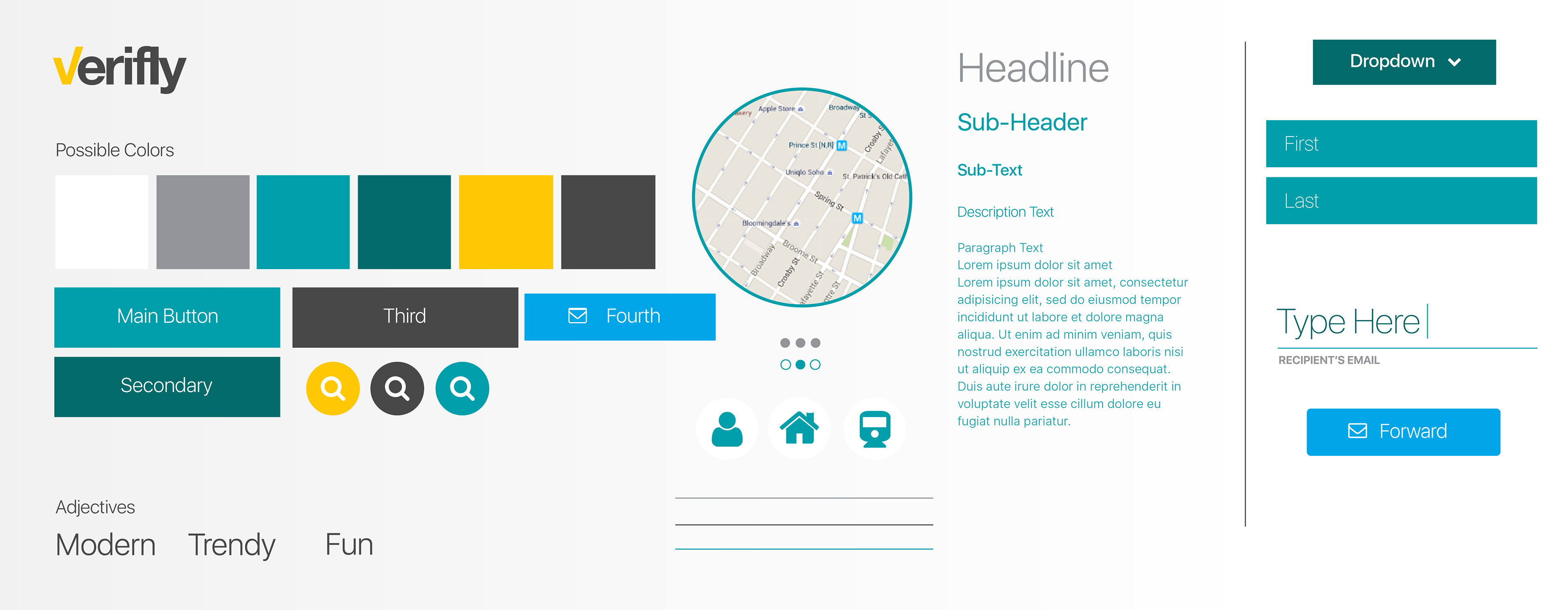
Style Landscapes
While designing the app, I created Style Landscapes, which are branding design options for the app. Without having to design the app, you can get a sense of what it would feel like.